

Color is far more than decoration. It quietly shapes how people feel, think, behave, and interact inside a space. Whether designing a cozy home, a productive office, or a welcoming commercial setting, understanding color psychology helps create interiors that support mood, function, and lifestyle goals.
Thoughtful color selection can make a room feel larger, calmer, warmer, more energetic, or more sophisticated—often without changing anything else.
What Is Color Psychology in Interior Design?
Color psychology studies how colors influence human emotion and behavior. In interior design, it helps professionals and homeowners choose shades that align with how a space should feel and function.
For example:
- A bedroom benefits from calming tones
- A kitchen thrives with energizing colors
- A workspace performs better with focus-enhancing shades
Instead of choosing colors only for appearance, designers use them as tools to shape experience.
Why Color Choices Matter in Interior Spaces
Color affects people instantly—even before they consciously notice it. The right palette can:
- Improve mood and relaxation
- Increase productivity and creativity
- Make spaces feel larger or cozier
- Influence appetite and social interaction
- Support sleep quality
- Enhance perceived temperature of a room
In short, color quietly controls the emotional atmosphere of a space.
Understanding Warm vs Cool Colors
Interior designers often begin by deciding whether a room needs warm or cool energy.
Warm Colors
Warm tones create comfort, vibrancy, and sociability.
Common warm shades include:
- Red
- Orange
- Yellow
- Terracotta
- Warm beige
They work best in:
- Living rooms
- Dining rooms
- Entryways
- Restaurants
- Social gathering spaces
Warm colors make spaces feel inviting and lively.
Cool Colors
Cool tones promote calmness, clarity, and focus.
Examples include:
- Blue
- Green
- Lavender
- Soft grey
- Cool white
They are ideal for:
- Bedrooms
- Bathrooms
- Offices
- Study areas
- Meditation spaces
Cool palettes support relaxation and mental clarity.
Emotional Effects of Popular Interior Colors
Each color communicates a slightly different emotional message. Choosing the right tone depends on the purpose of the room.
Blue: Calm and Stability
Blue promotes peace and concentration.
Best used in:
- Bedrooms
- Study rooms
- Home offices
- Bathrooms
Lighter blues feel airy, while deeper blues add sophistication.
Green: Balance and Renewal
Green connects interiors with nature and improves comfort.
Ideal for:
- Living rooms
- Bedrooms
- Reading corners
- Wellness spaces
It reduces stress and supports long-term relaxation.
Yellow: Energy and Positivity
Yellow introduces optimism and brightness.
Works well in:
- Kitchens
- Breakfast areas
- Entryways
- Creative studios
Soft yellows feel cheerful, while strong yellows stimulate alertness.
Red: Passion and Activity
Red increases energy and attention.
Recommended for:
- Dining areas
- Accent walls
- Entertainment rooms
Use carefully—too much can feel overwhelming.
Neutral Colors: Flexibility and Elegance
Neutral palettes form the backbone of timeless interiors.
Examples include:
- White
- Beige
- Taupe
- Grey
- Cream
They:
- Expand visual space
- Reflect light effectively
- Support layered décor styles
- Allow accent colors to stand out
Neutrals are essential for balanced interiors.
How Color Affects Room Size and Lighting Perception
Color can visually reshape a room without structural changes.
Lighter colors:
- Make spaces feel larger
- Reflect more light
- Improve openness
Darker colors:
- Add depth and drama
- Create intimacy
- Highlight architectural features
Similarly:
- Cool tones visually recede
- Warm tones visually advance
Designers often combine both to control spatial perception.
Choosing Colors Based on Room Function
Successful interiors match color choice with purpose.
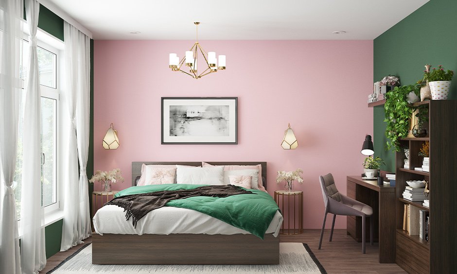
Bedroom
Recommended shades:
- Soft blue
- Sage green
- Lavender
- Warm neutrals
These promote better sleep and relaxation.
Living Room
Good options include:
- Warm beige
- Earthy greens
- Muted terracotta
- Soft greys
They support conversation and comfort.
Kitchen
Effective choices:
- Yellow accents
- Cream tones
- Light green
- White palettes
These encourage energy and freshness.
Home Office
Best-performing tones:
- Blue-grey
- Muted green
- Soft white
- Dusty navy
They enhance concentration and productivity.
The Role of Accent Colors in Interior Design
Accent colors add personality without overwhelming the space.
They can be introduced through:
- Cushions
- Artwork
- Rugs
- Curtains
- Lamps
- Feature walls
A well-chosen accent color:
- breaks monotony
- highlights focal points
- creates visual rhythm
- adds emotional contrast
Even small additions can dramatically shift a room’s mood.
Cultural Influence on Color Meaning
Color interpretation varies across regions and traditions.
Examples include:
- White symbolizes purity in many Western cultures
- Red represents celebration and prosperity in many Asian contexts
- Green often connects with nature and harmony worldwide
Understanding cultural meaning ensures designs feel respectful and appropriate.
Common Mistakes to Avoid When Selecting Interior Colors
Even attractive colors can fail if used incorrectly.
Avoid these mistakes:
- Choosing paint before testing lighting conditions
- Using too many bold shades in one room
- Ignoring furniture and flooring undertones
- Following trends without considering lifestyle needs
- Skipping sample testing on walls
Testing colors at different times of day helps prevent disappointment.
How Lighting Changes the Appearance of Color
Lighting dramatically alters how colors appear indoors.
Natural daylight:
- reveals true tones
- enhances clarity
Warm artificial lighting:
- deepens warm colors
- softens cool shades
Cool artificial lighting:
- sharpens blues and greys
- reduces warmth
Always evaluate color choices under real lighting conditions before final selection.
Tips for Creating a Balanced Interior Color Palette
Professional designers often follow a simple structure:
60–30–10 rule
- 60% dominant color (walls)
- 30% secondary color (furniture)
- 10% accent color (decor)
This creates harmony while keeping the space visually interesting.
Additional tips:
- Repeat colors throughout rooms
- Limit palette to 3–5 main tones
- Combine textures with color layers
- Use neutrals as anchors
Consistency makes interiors feel intentional rather than accidental.
FAQs
1. Can colors really affect mood inside a home?
Yes. Research shows color influences emotional responses such as calmness, alertness, comfort, and energy levels.
2. Which color is best for small rooms?
Light shades like soft white, pale grey, and pastel tones make small rooms appear larger and brighter.
3. Should every room in a house follow the same color palette?
Not necessarily. Rooms can vary, but maintaining a connected palette across spaces improves visual flow.
4. Are dark colors suitable for interiors?
Yes. When used strategically, dark tones add elegance, depth, and intimacy—especially on accent walls.
5. How do I choose between warm and cool color schemes?
Consider the room’s purpose. Social spaces benefit from warm tones, while rest and work areas benefit from cooler palettes.
6. Do ceiling colors affect room perception?
Yes. Lighter ceilings increase perceived height, while darker ceilings create a cozier atmosphere.
7. Is it better to follow trends or personal preference when selecting colors?
Personal comfort should guide decisions. Trend-based colors work best when adapted to individual lifestyle and space needs.